

PT: 🇧🇷
Svelte: “Conectando você ao futuro da tecnologia”. Na Svelte, nós não apenas vendemos produtos tecnológicos, nós abrimos portas para o futuro. Somos uma autoridade incontestável no campo da tecnologia, dedicada a trazer as últimas inovações diretamente para suas mãos. Nossa gama diversificada de dispositivos de ponta e soluções tecnológicas são cuidadosamente selecionados para garantir que você esteja sempre um passo à frente
EN:
Svelte: “Connecting you to the future of technology”. At Svelte, we do not just sell technological products, we open doors to the future. We are an unquestionable authority in the field of technology, dedicated to bringing the latest innovations directly to your hands. Our diverse range of cutting-edge devices and technological solutions are carefully selected to ensure that you are always one step ahead

PT: 🇧🇷
A marca Svelte foi cuidadosamente projetada com uma paleta de cores minimalista: preto e branco. Essas cores representam elegância, sofisticação e clareza. O preto simboliza autoridade, enquanto o branco oferece espaço para a criatividade florescer. Juntas, elas formam a base sólida da Svelte, criando uma identidade visual atemporal e impactante.
EN:
The Svelte brand was meticulously crafted with a minimalist color palette: black and white. These colors embody elegance, sophistication, and clarity. Black symbolizes authority, while white provides a canvas for creativity to flourish. Together, they form Svelte’s solid foundation, creating a timeless and impactful visual identity.


PT:
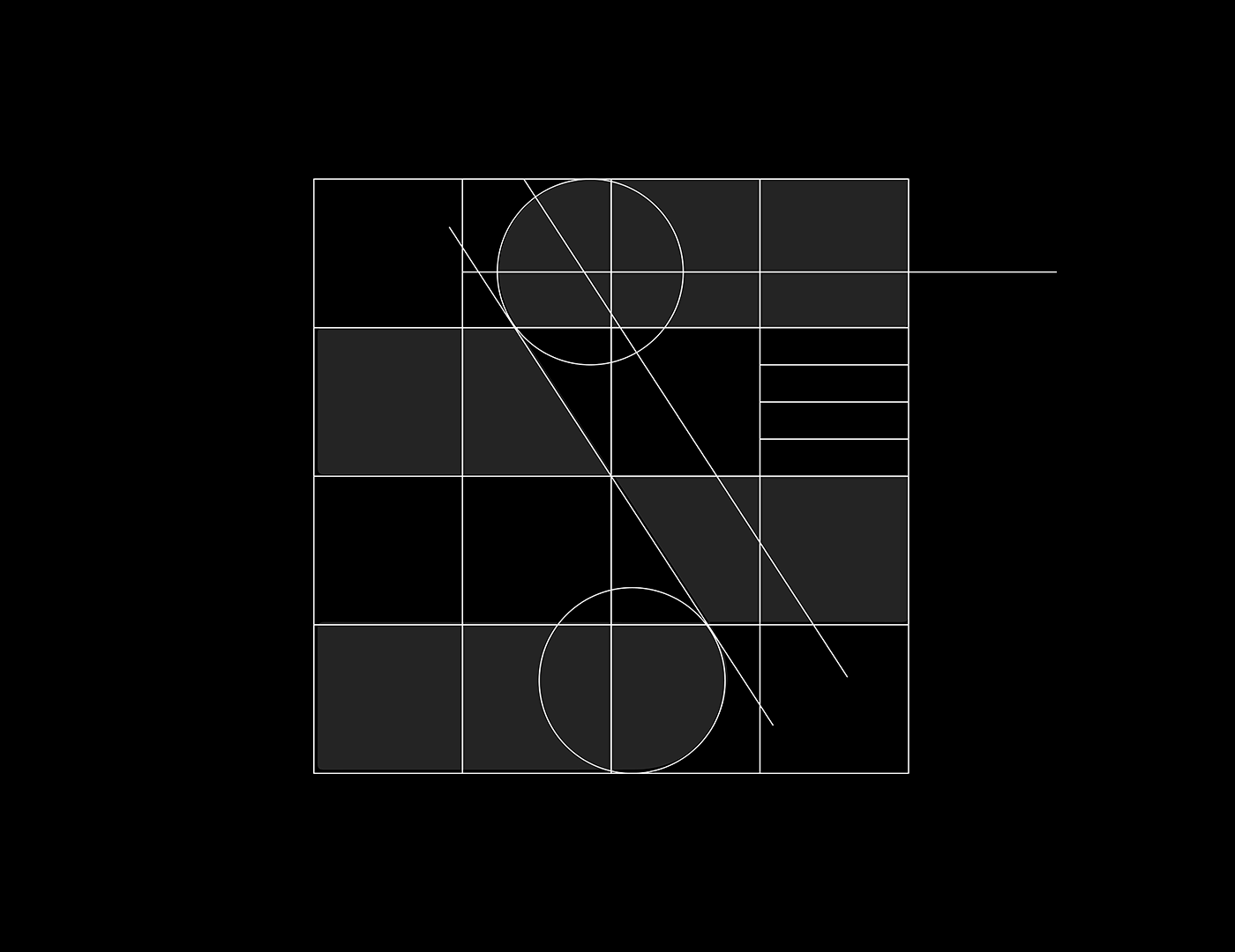
O símbolo é um ‘S’ distinto e elegante. Apresenta linhas retas e ângulos agudos, desviando-se do design de ‘S’ curvado típico. A simplicidade e a ousadia do ‘S’ preto em um fundo branco transmitem uma sensação de modernidade e sofisticação. O design minimalista e arrojado do ‘S’ reflete uma abordagem direta, inovadora e sempre voltada para o futuro. A clareza e acessibilidade do design representam a conexão com o cliente. Cada aspecto do símbolo ‘S’ foi cuidadosamente considerado para representar a missão e os valores da empresa.
EN:
The symbol is a distinct and elegant ‘S’. It features straight lines and sharp angles, deviating from the typical curved ‘S’ design. The simplicity and boldness of the black ‘S’ on a white background convey a sense of modernity and sophistication. The minimalist and bold design of the ‘S’ reflects a straightforward, innovative, and always forward-looking approach. The clarity and accessibility of the design represent the connection with the customer. Every aspect of the ‘S’ symbol has been carefully considered to represent the mission and values of the company.


THANK YOU <3 contact - Guilherme Designer (@guidzn_)


